

TUI / Internal content services
Services made findable.
A responsive internal website that turned complex content services into clear, task-led journeys, from information architecture to production delivery.
Inspect the website- Client
- TUI
- Status
- Designed / prototyped / launched
- Role
- Senior Product Designer, UX/UI Designer & Information Architect
- Scope
- Information architecture, responsive design, prototype and production website
Connected challenge
Complex services needed a simple front door.
Colleagues across the business needed to understand what the Content Hub offered and identify the right route without first understanding the team’s internal structure.
The website also needed to hold TUI’s visual identity, rich media and detailed service content together without allowing any one of them to obscure the task.
Information architecture
The hierarchy followed user tasks, not the organisation chart.
Three clear service families gave the site a stable top level. Each family could then introduce detailed offers without forcing every visitor through the same content sequence.
Products
Explain the platforms and capabilities available to colleagues.
Services
Connect business needs to the support the team could provide.
Help
Give people direct routes to guidance, support and contact.
User journey
Progressive detail kept the route understandable.
The journey moved from an immediate need to a service family, then into specific information and a clear action. Rich media supported that path where it added meaning.
- 01 Orient Understand the Content Hub’s purpose
- 02 Choose Select products, services or help
- 03 Inspect Read the relevant offer and evidence
- 04 Act Follow guidance or contact the team
Design to delivery
The approved journey continued into production.
- 01 Structure Information hierarchy / responsive wireframes
- 02 Express TUI Next language / high-fidelity interface
- 03 Validate Interactive Figma prototype / journey review
- 04 Deliver Developed responsive production website
Design progression
The service architecture survived every stage of delivery.
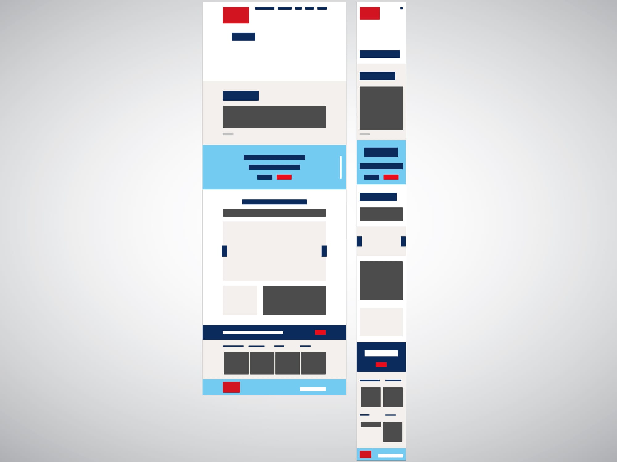
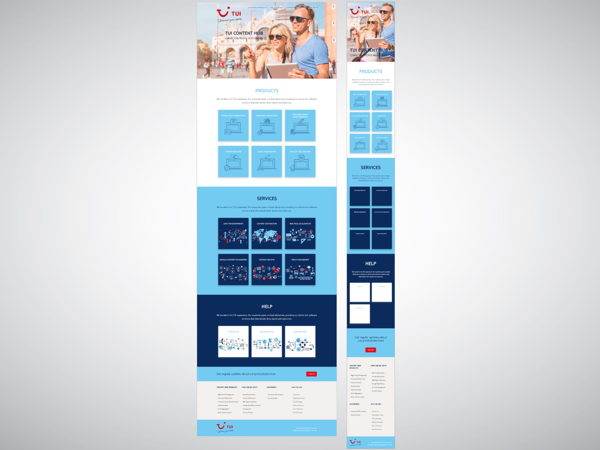
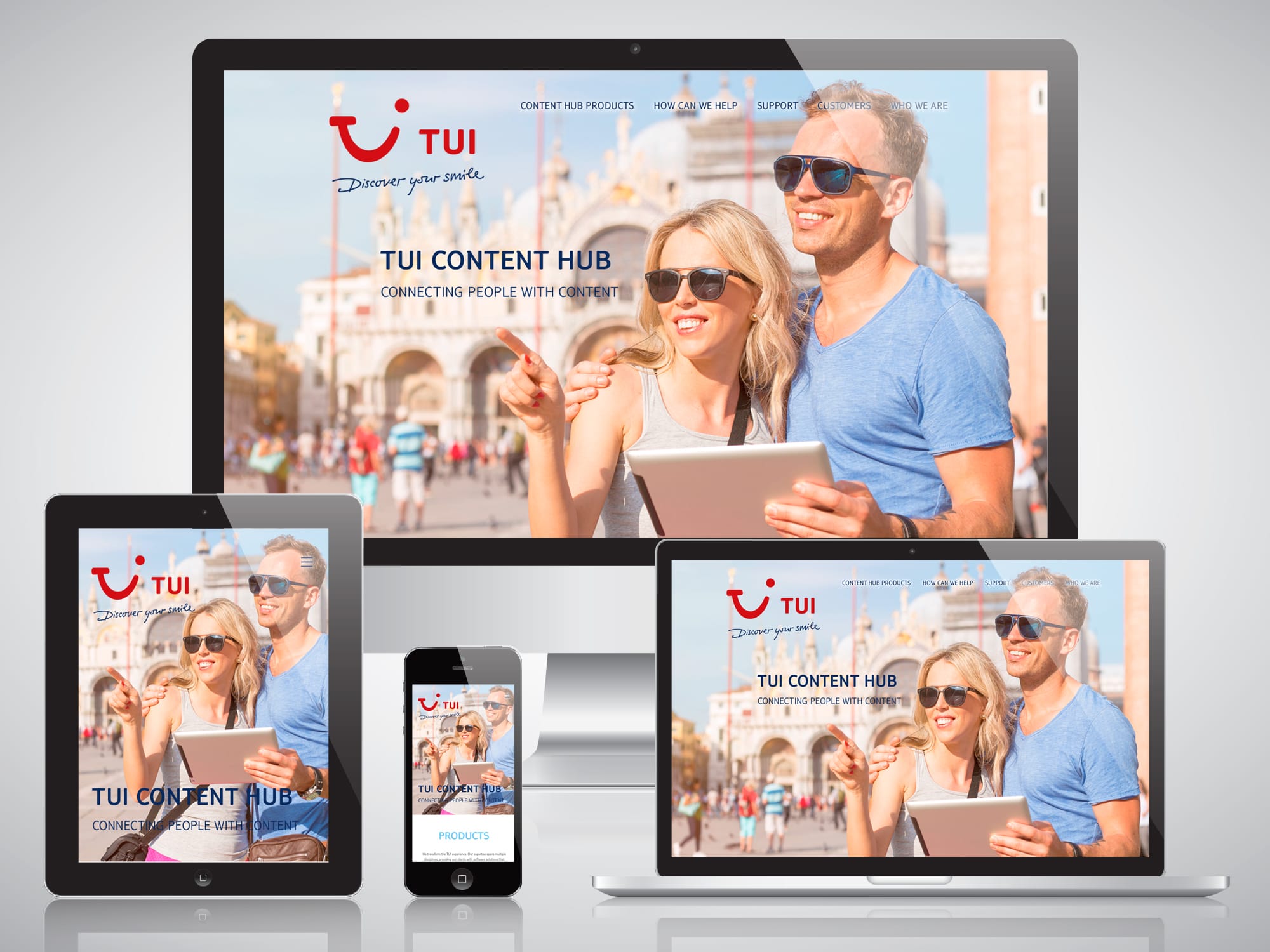
The responsive structure established in wireframes carried through high-fidelity design and into the finished presentation, preserving the same task-led hierarchy as visual detail increased.
Decision register
Three decisions kept the service story coherent.
The site needed to feel recognisably TUI while remaining useful as an internal route through detailed and unfamiliar services.
- 01 Lead with tasks.
Information was grouped around what colleagues needed to understand or do, not around the team’s internal organisation.
- 02 Make media earn its place.
Rich imagery supported service explanation and brand expression without replacing useful labels or content hierarchy.
- 03 Carry decisions into code.
Moving from prototype into front-end delivery protected the approved structure and responsive behaviour from a handover gap.
Delivery evidence
Designed, validated, developed and launched.
Evidence boundary
The website launched and was directly observed in internal use.
The delivered design, prototype and production website are confirmed. Adoption, comprehension and efficiency were not formally measured, so none are claimed.
Stakeholder perspective
The work between wireframe and launch mattered too.
Much of the design value sat in prototyping, explaining options, listening to users and helping stakeholders move from competing requirements to a workable route.
“I have always admired his ability to present options, listen and really understand the end users, motivate and get people on board with ideas and realistic examples.”
Read full testimonial
I am so lucky to have Michael in the team; few people have the chance to work with a designer who is not only great at what he does but also has a good personality; luckily, I had the opportunity while working with Michael. Michael’s work is of very high standards and exceeds even the most “picky” expectations, and he has earned my respect and admiration as a solid and knowledgeable resource at Content Hub in TUI Group. He is fantastic at early prototyping and wireframing for projects, and his communication with customers during the meetings and demos is outstanding, clear and ready to explain the work whilst listening and implementing required changes. I can particularly stress his calculated and prompt reply when dealing with challenges, his ability to manage multiple projects of varied characteristics in sprints of different projects in parallel and his willingness to help when required. I truly believe that he has made a dramatic difference in the productivity and quality of the teams he has worked with, with his manner and expertise. It was not always easy with our clients, and we had some heated "challenging" times, but I have always admired his ability to present options, listen and really understand the end users, motivate and get people on board with ideas and realistic examples. Michael is a person of solid expertise, knowledge and delightful taste for user interfaces, and anybody would be lucky to have him as part of their team.
Next case study
Chevin Fleet Solutions Brand Identity
Need complex services to feel straightforward?
Tell me what people need to understand, what routes they need to follow and where the experience must lead.
Start a conversationI usually respond within two working days.