

Chevin Fleet Solutions / Brand identity
One identity. Every scale.
A geometric identity system designed to retain continuity and clarity from application icons and favicons to print, vehicle signage and environmental use.
Inspect the identity- Client
- Chevin Fleet Solutions
- Status
- Delivered / rolled out
- Role
- Brand Identity Designer
- Scope
- Logo system, wordmark, palette and cross-channel application
Scale challenge
Continuity had to survive a much wider field of use.
The established identity needed to become more consistent and contemporary without discarding the visual recognition Chevin had already built.
The same system also had to remain usable across interfaces, compact application marks, print and large environmental formats.
Construction principle
Proportion generated the form. The eye finished it.
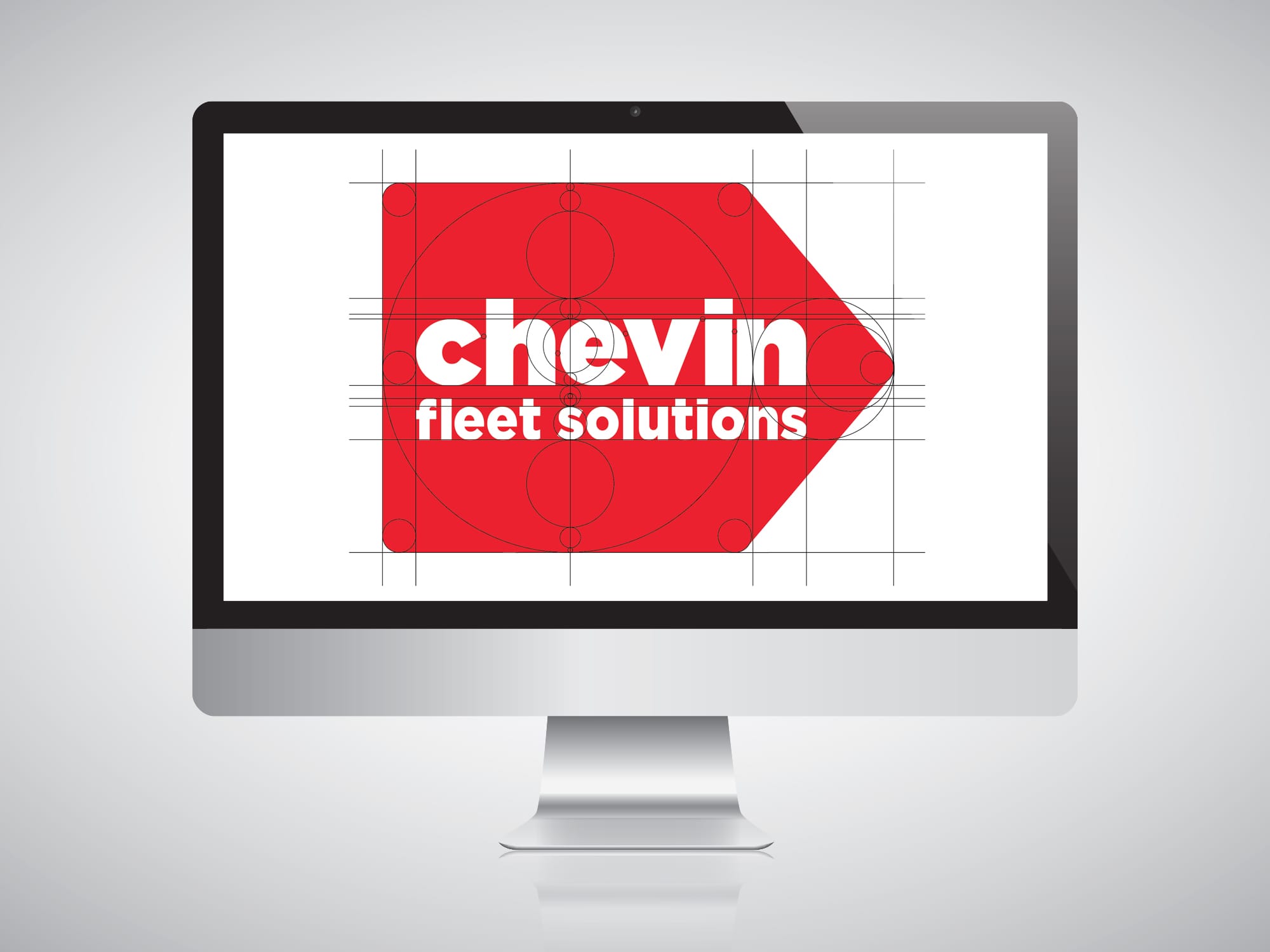
Fibonacci relationships provided a disciplined starting structure. Corners, spacing and the relationship between symbol and wordmark were then refined optically rather than forced to obey a diagram.
- 01
- Structure Use proportion to organise the primary relationships.
- 02
- Soften Refine geometry so the mark feels balanced and approachable.
- 03
- Correct Adjust spacing and weight according to visual performance.
Construction evidence
Proportion provided the structure. Optical judgement resolved the identity.
The construction study shows how circular proportions, alignment and directional geometry established repeatable relationships before spacing, balance and the final wordmark were refined by eye.
Scale system
The identity was designed as a family of behaviours.
The symbol, wordmark and supporting palette needed enough flexibility to retain clarity when space, distance and production method changed.
- COMPACT Favicon Reduced geometry / immediate silhouette
- INTERFACE Application Symbol and colour inside product contexts
- DOCUMENT Print Wordmark hierarchy and controlled reproduction
- ENVIRONMENT Signage Long-distance form and directional character
Identity components
Mark, wordmark and colour were resolved together.
Each element had a distinct job, but none was treated as a separate exercise. The system’s recognition depended on their combined behaviour.
Directional mark
A simple forward form retained the established sense of movement.
Adjusted wordmark
Spacing and proportion connected the name to the geometry of the mark.
Application palette
A strong primary colour was supported by complementary cross-channel colours.
Application field
One system across digital and physical touchpoints.
Decision register
Three decisions protected continuity and scale.
The identity had to become more systematic without becoming generic, and more geometric without allowing construction theory to outweigh perception.
- 01 Reduce to a clear silhouette.
The directional mark remained identifiable when detail and available space were reduced.
- 02 Treat proportion as a tool.
Geometric relationships generated coherence, while optical correction resolved the final balance.
- 03 Design the whole system.
Symbol, wordmark, colour and application behaviour were developed as connected identity components.
Rollout evidence
Applied across digital, print and environmental use.
Evidence boundary
The identity system and its cross-channel rollout are confirmed.
Recognition, brand recall and commercial performance were not formally measured, so none are claimed.
Rollout perspective
The identity had to survive the handoff.
The strongest external evidence is not simply approval of the mark. It describes a system that could move across product, print and physical applications while giving different teams one reference to work from.
“He delivered the system as a complete package: mark, wordmark, palette and clear application guidance, built to hold up across our product interfaces, print and vehicle signage without derailing our sprint schedule.”
Read full testimonial
Working with Michael on our identity rollout was refreshing from a project management standpoint: no scope creep, no last-minute surprises. He delivered the system as a complete package: mark, wordmark, palette and clear application guidance, built to hold up across our product interfaces, print and vehicle signage without derailing our sprint schedule. The handoff was clean enough that engineering, product and client success could all work from the same reference without a translation layer in between. We hit our rollout dates on schedule, and the team stayed in sync the whole way through.
Next case study
Marvel Strike Force Information Design
Need an identity to work beyond the logo file?
Tell me what the brand must retain, where it needs to perform and which applications will test it hardest.
Start a conversationI usually respond within two working days.